Package Redesign
My Redesign of Stop & Shop Flour
Overview
For this assignment, the goal was to find an example of a package with a really poor design. I chose Stop & Shop store brand flour, because of its plain and uninviting design, as well as the poor design of flour packaging in general. The goal of this project is to make the design more appealing, and the construction of the package itself a better user experience.
Section 1: About the Client
What is the full name of the client brand?
The name of the brand is Stop & Shop all purpose flour. It is the store’s brand, or generic version of all purpose flour.
What industry are they in, and what is their position within the industry?
Stop and Shop is a chain of grocery stores, with 415 locations nationwide, that primarily serves the Northeast United States. It is a subsidiary of Ahold, which also owns the competing companies in the Northeast.
Who is the customer for this product?
The customer for this product is the home baker.
Section 2: Their Challenge
What issue, challenge, or pain point did you feel the customer might experience?

The consumer who purchases this product has undoubtably experienced trouble with the package itself. The poor flimsy construction has a tendency to break, causing the contents to explode everywhere. The design of the package is uninviting, and seems to accentuate the fact that it is the cheapest product on the shelf.
Section 3: Your Solution
How did you approach the challenge?
The reason I chose this project was based on my own user experience. Having had many bags of flour explode on me, and also having to use the bag as a container after opening, I decided it would benefit from a redesign.


I chose to make the package out of a sturdier material, and also make the package itself more appealing. The original package was very bland and had a strange texture pattern on it that resembled lizard scales.
Additionally, I decide that the package could be more user friendly. I though that the package could have an easy pour spout on the side of the container, and the cap could also be used as a measuring cup.
What was the timeline?
The timeline for this project took around one week. The redesign to make the package more appealing was a combination of the above sketches. The idea was to give the package an old-time feel that would appeal to current customers and older generations, while also promoting a feeling of trust that would appeal to the younger one. The package itself, was done quicker, as I had a poor user experience in the past, and had thought that there could be a way to improve this. Implementing the new package design would take a fair amount of time, as the package itself would be of a different shape, and new material. However, for aesthetics alone, the change could be implemented much faster.
What was the solution?
The solution was to make the package more appealing, while maintaining a sense of trust and reliability.

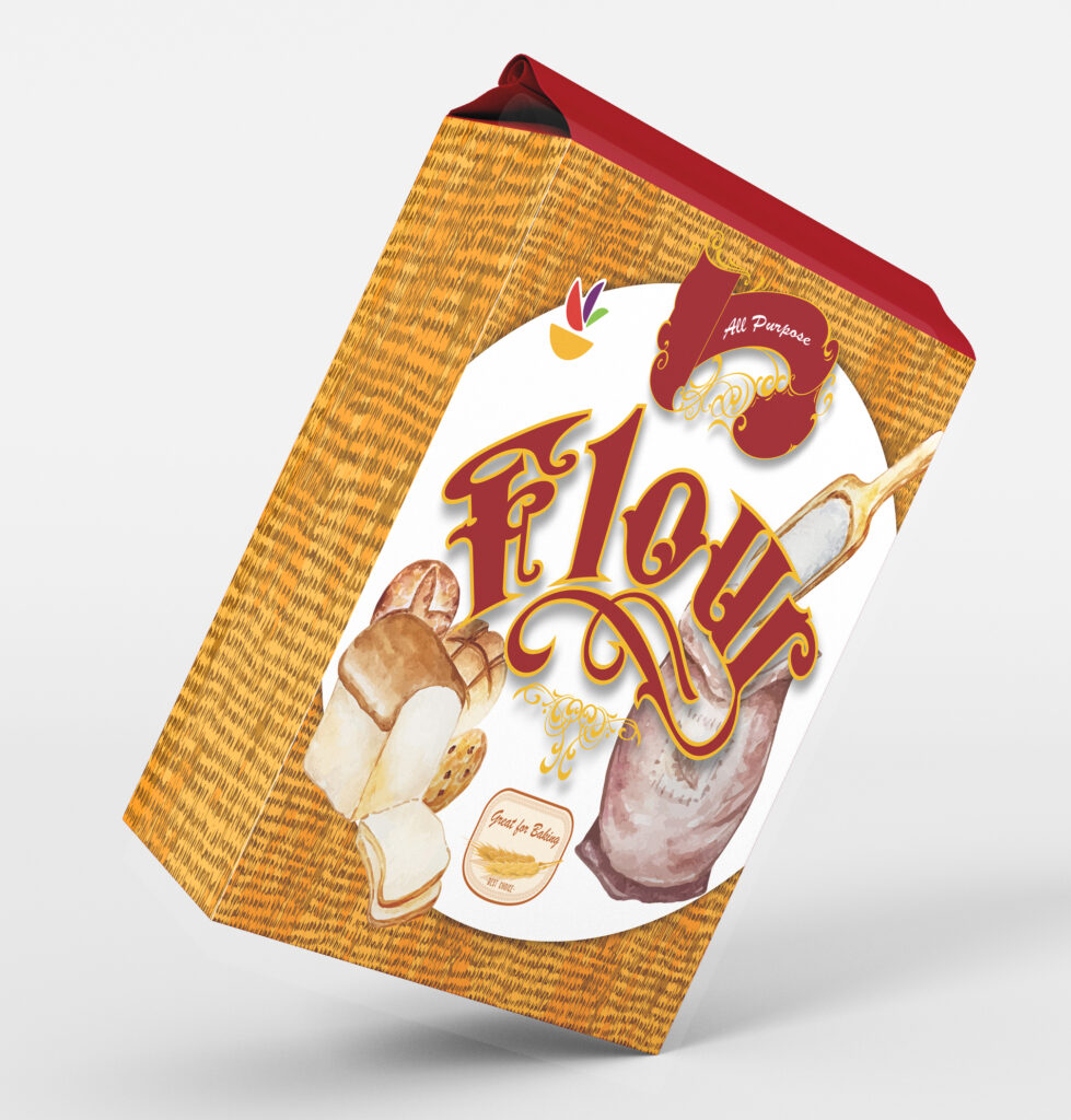
Above are some examples of what the package could look like, if the design of the package alone was changed. In the mockup to the right, the package has been rendered out of a sturdier material, which would alleviate some of the issues with the package itself. It would also be able to implement this new design in a more reasonable time frame.