Ganache
Ganache
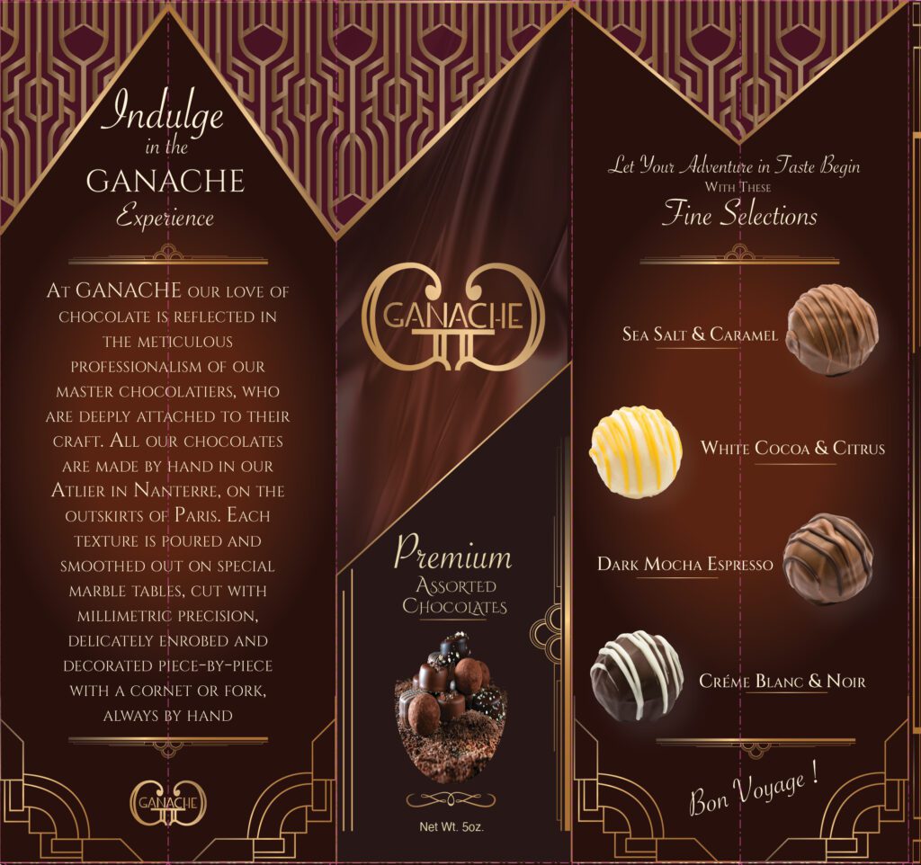
For this project we were tasked with creating an upscale candy company and designing the packaging for it. Above is the candy box I created for a company called Ganache. We had a choice of product from cookies, to popcorn, to candy, to anything covered in chocolate. That is where I came up with idea to do a fine chocolate company. I chose the name Ganache because it is literally a chocolate covering.
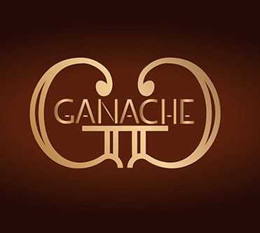
The Logo

Here is the final logo. I designed the font myself. I couldn’t find one that I felt fit the product so I decided to make one that I felt best suited the message I was trying to convey. I used the twin “G” letters facing each other because it is something one might see on many upscale or designer brands. I made the letters gold to relate the sense of opulence that is associated with gold.