New Harvest Coffee Roasters UX Journey
Commercial Coffee Competitive Content Audit
This project introduced us to UX/UI design by having us choose a local coffee shop for re-branding. We researched some well known coffee shops and what they represented, and then our own to try and understand the user experience and how it could be improved. As the project progressed, I developed a deeper understanding of all that goes into the user experience after the logo and basic branding functions are complete.
Coffee Shop UX/UI Project
We first explored two Dunkin’ Donuts and two Starbucks to get a feel for how everything was laid out in these more established companies. Next we tried to identify the affordances and limitations of these establishments as they pertained to the user experience. We then identified the persona of the restaurants by establishing what kind of individual would frequent each shop respectively.
Commercial Coffee Competitive Content Analysis
We determined the persona of these two restaurants to be very different from each other. The persona of Dunkin’ was more a grab and go for the working man, while Starbucks seemed more to cater to the soccer mom out running errands. The quality of each was reflected in their product. For Dunkin’ you get coffee; no real bells and whistles. At Starbucks you get a much better cup of coffee, but have to learn a different language to order. The Vibe of Dunkin’ isn’t particularly suited to individuals wanting to stay and enjoy their purchase. Starbucks is more suited to the individual who would like to get some work done or read a book.
Target Coffee Shop Content Audit
We took what we learned from the previous experiment and applied it to our own coffee shop. The persona that we came up with for New Harvest was that of a professional on the go in the morning, a mix of that crowd and that of a RISD type in the afternoon, and at night (since they also serve alcohol) an artistic crowd interested in music and the arts looking for an alternative to the typical bar. The quality of the coffee is top notch. They direct source from the farms they buy from, and roast their own beans. There is no middle man. In fact, they supply many other local shops with the coffee that they sell. The vibe of the shop is very laid back. It is tucked away in the Farm Fresh Food Hub in Providence, off the beaten path. Its inaccessibility adds to its charm. They don’t get the person who is in a rush and impatient, or the parent with a gaggle of children who needs a quick pick-me-up. Its quiet atmosphere makes it the perfect place to relax and enjoy a superb cup of coffee.
Target Persona
The target persona seems to differ depending on the time of day. The main point that seems to ring true regardless is that the customer has to have a passion for coffee. They offer classes to help people have a better understanding of the brewing process, as well as, a better understanding of the journey of the bean from purchase to cup. They are very involved in the local art and music scene, and their clientele reflects that. Additionally they offer alcoholic beverages which give a nice alternative to the traditional bar scene. The overall persona is that of an upper middle class individual, between 25-45, who is interested in great coffee and the arts. The atmosphere is conducive to having a nice relaxing time out regardless of the time of day.
Target Whitespace Analysis
The whitespace analysis gave us the chance to look for opportunities that our company could take advantage of to improve where they may be lacking. We started by comparing our company to others in the area, and see how they stacked up as far as price point, accessibility, food offerings, atmosphere, speed, etc. What we discovered was that New Harvest was missing the opportunity to capitalize on the space they had available and expand their seating area. They also could introduce more food items to help retain guests for longer periods of time. The atmosphere was less formal than that of a traditional sit-down restaurant, but more inviting than that of a Dunkin’ Donuts. The price point was fair, and the staff was very knowledgeable.
Target Value Prop Canvas
The target value proposition canvas allowed us to visualize the pains, gains, and jobs to be done versus the gain creators, pain relievers, and products and services. By having a visual representation of what we could work on, it helped to determine the direction we needed to go in order to improve the user experience. We were able to take this information, and implement it into a new value proposition for the company.
Target Value Prop Analysis
The original value proposition was “Coffee, just coffee”. However, after reviewing the proposition canvas, we realized that New Harvest was much more than that. We took the information from the proposition canvas and boiled it down into a simple statement that we feel better represented the company. After doing the research we concluded that the new value proposition would be “A place to wake up, or wind down”.
Hierarchical List
For the next phase of the project, we had to look at the affordances that our coffee shop had available. We then listed all of the services offered, as well as some new ideas that we were able to glean from our whitespace analysis. This was helpful in the next stage of our process where we were tasked with designing a user interface with for customers using their cell phones.
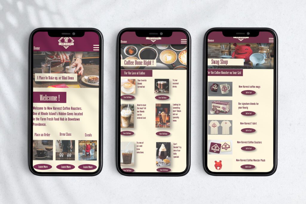
We took this information and trimmed it down to the essential items, which was helpful to direct our focus of the project. The list we created included the current offerings of coffee, cocktails, food, classes, and events. we also included the new additions of more food items on the menu and the introduction of a food truck. Above is an image of what the customer might see when they enter New Harvest, scan a QR code, and gain access to the shop’s website.
Target Persona Journey Map
For this portion of the project we were tasked with envisioning what a typical customer’s journey might be like when they visit New Harvest. This was helpful because it put us in the shoes of the guest, and we had to account for everything that they may experience. We used this information to create an experience that we ourselves would want to have. The process is easy to understand, and the experience is enjoyable.
SWOT Diagram
The Purpose of the SWOT diagram was for us to brainstorm all of the strengths, weaknesses, opportunities, and threats that our coffee shop could encounter. Like the whitespace diagram, this helped us to visualize what our company was doing well, where they needed improvement, and what we could do to make the customer’s experience better. We took these ideas and boiled them down into the ones that made the most sense to implement into our company without compromising what they have already established.
SWOT Analysis
After we had determined what the key components of our SWOT diagram were, we put them into this table to help with our value proposition and journey map. The table has more strengths and opportunities than threats and weaknesses. We determined that this was beneficial to our goal of improving user experience, and decided to move forward with these ideas when constructing our journey map and mobile interface.
Target Revised Value Proposition
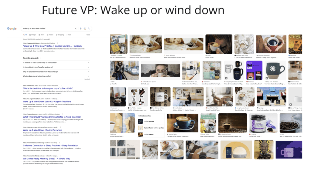
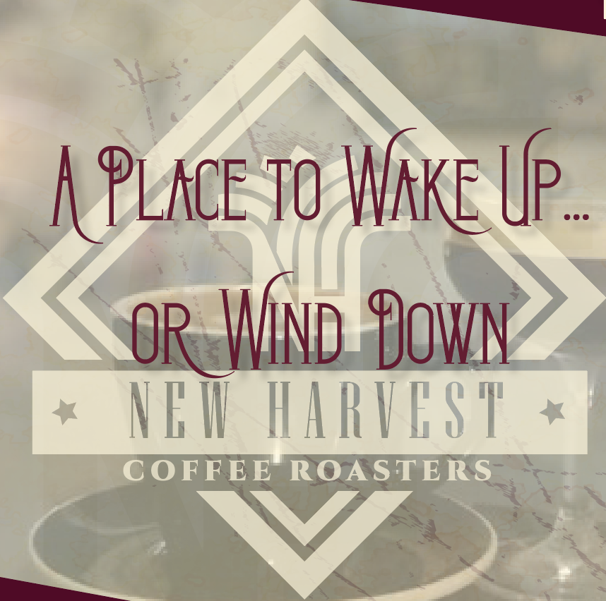
As mentioned earlier we felt that New Harvest was more than just coffee, and our research has proven that. We took the information that we had and used actual customer testimonials to come up with the new value proposition of “A place to wake up, or wind down”. We feel that the new value proposition is more inviting and also keeps with the original aesthetic. To be clear that our new value proposition was not already in use by another company we did an internet search of the phrase and an image search. After doing these searches, we concluded that it was not in use by any other company.
Target Logo Evolutions
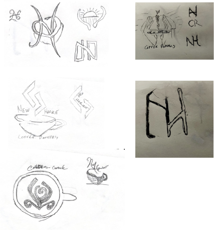
These are the very beginning stages of the logo process. We tried to incorporate the initials of New Harvest and corollate then with coffee. We decided to wanted to use iconology that represented the name.
After we had done some sketches, we went to Adobe Illustrator to refine the image we were looking for. As you can see, there were many iterations, before we settled on something that we felt best represented the shop.
Above is the final version, which has been simplified to present a minimalist effect. The “N” and the “H” in the center are a re-worked version of the symbol for harvest. We choose to lighten the cream color and soften the red to give off a mellow vibe that suits the company very well.
Target Logo Merch
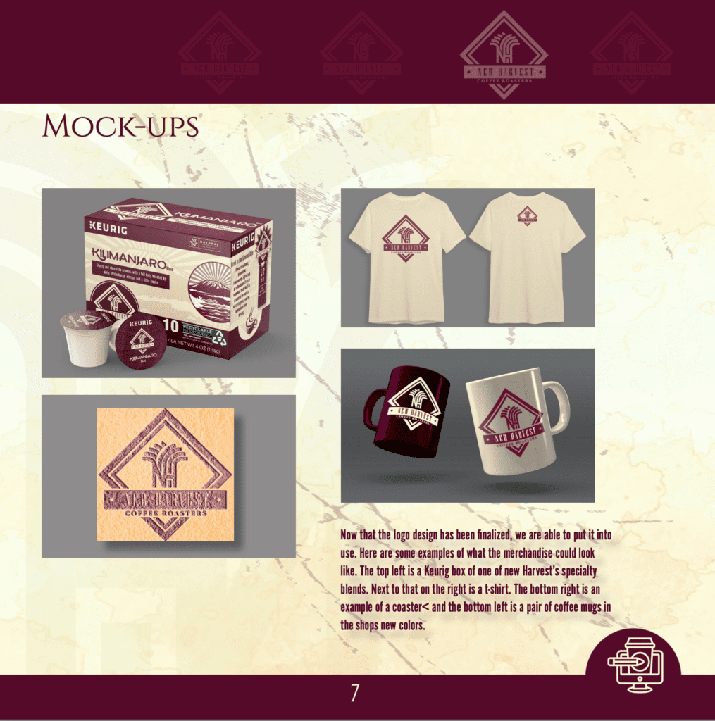
Once we had the logo and colors established, we were able to move on to the merchandising stage. We thought of items that the company currently sells, and added the k-cups, and applied the logo to see how it would look in real world applications. For the Keurig box, we chose one of New Harvest’s signature blends, and used the company colors on the t-shirts, coffee cups, and coaster.
Target Mobile Website Wireframe
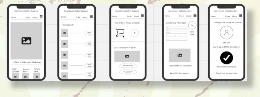
At the top we created what the mobile interface would look like based on our journey map,SWOT diagram, and whitespace analysis. Below We have the mobile mockups of what the user interface might look like
Target Mobile Website Prototype
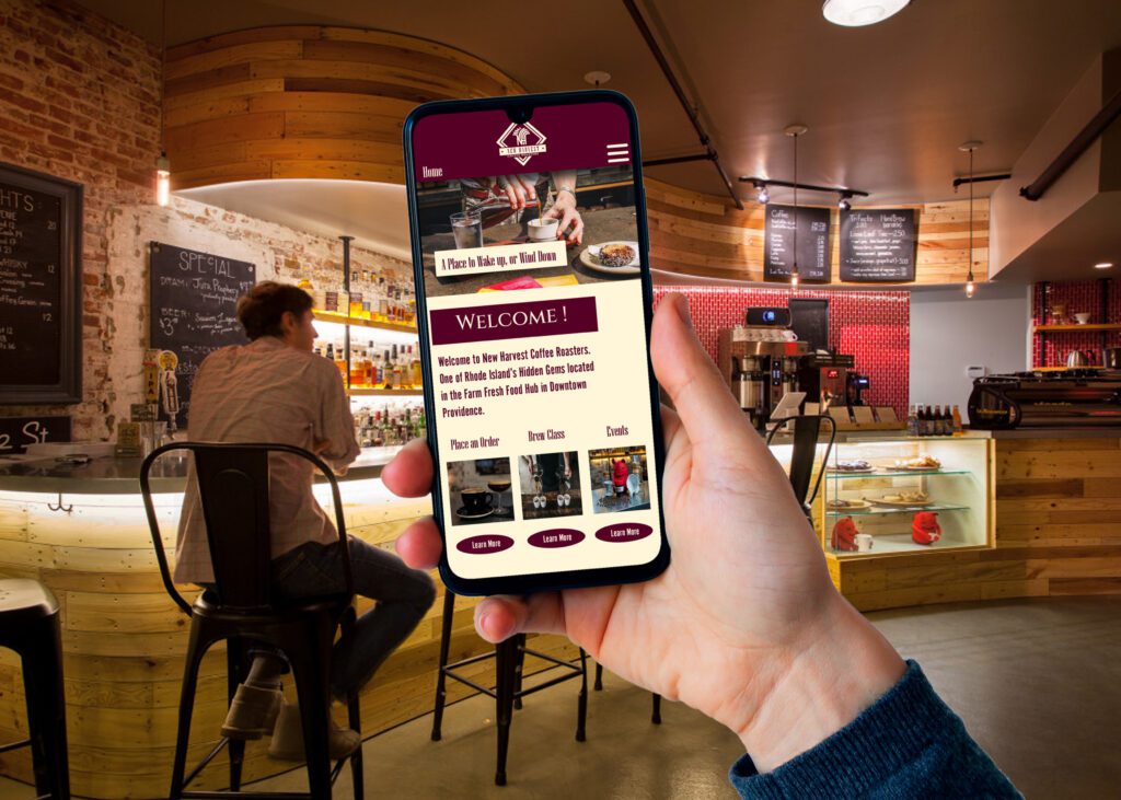
This is an image of what the user could expect to see after they enter New Harvest and scan the QR code at the entryway of the shop.