Town Re-Brand
Hometown Branding
The Project
For this assignment we were tasked with re-branding our hometown and making a trifold brochure for tourists who would be interested in visiting. We had to start by doing some research about our hometown, and compile it into a worksheet that we would later use in our brochure. First, we had to find some imagery that was representative of our hometown and find a way to incorporate that into a logo. Next we had to find what attractions our town had to offer, be it food, landmarks, events, etc. and work those into our design. Finally, we had to come up with different assets that we that fit the “brand” format that we had come up with.
The Logo
Here is the logo that I came up with to represent Providence, which is my hometown. There are so many things that could be used as iconography to represent the city, it was difficult to find a starting point. I first thought about using a silhouette of the city’s iconic skyline, but after doing some research, I realized it had been used in almost every representation I could find. I decided to use the archway that signifies the entrance to Federal Hill. It is a very well-known Providence landmark and I was able to incorporate it into the name of the city. I use the acorn (some call it a pineapple) to dot the “i” in Providence, and felt that the archway gave the logo some good movement.
The Outside Cover
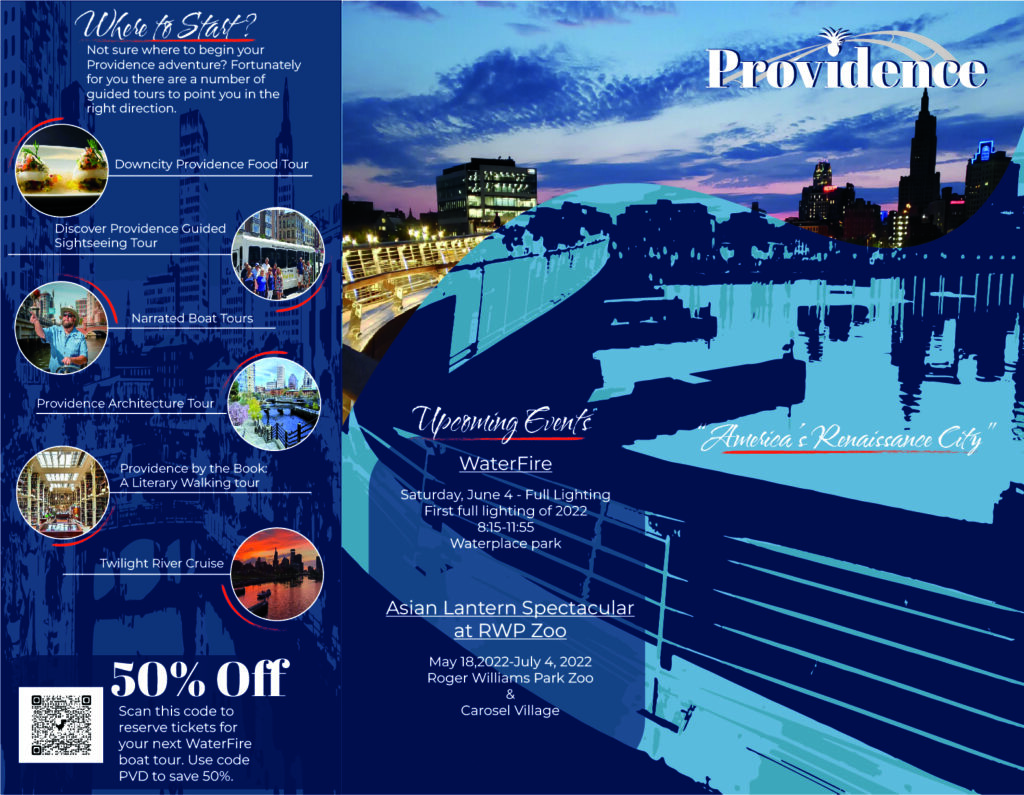
As you can see this cover also includes the inside flap of the trifold. For the front and back cover, I wanted the image to bleed from one to the other. I wanted to use just one image so that the viewer would have to look at both side to see the full image. I choose an image from the pedestrian bridge that shows the iconic skyline I mentioned before. I felt like I had to include that. The tag line of ” America’s Renaissance City” is one of the many names that has been given to Providence, but I felt it best suited this project. I chose to render the bottom portion in a more artist nature to emphasize the tag line. I also created a “swoop” to go through from front to back to give the idea of a wave since Rhode Island is known as the Ocean State. I also wanted incorporate the blues because they are the colors of the city’s seal. For the inside panel I decide to list some of the activities available so that the viewer would at least have an idea of where to start their journey without having to navigate the entire brochure.
The Inside Content
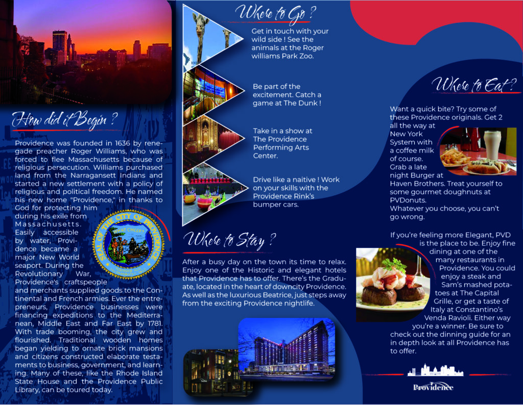
Here on the inside I began with a brief history of the city. I felt that anyone who isn’t familiar with Providence would like a brief overview before they started their adventure. Next I included some of the major landmarks and the events held there which I thought were essential to anyone who visits Providence to get the full experience. I included some of the more renowned hotels for place to stay. They are a bit more on the elegant side, but are a great addition to the overall experience. I then included some of the place to dine. Everyone who visits Providence needs to go to these places at least once. They are legendary in the Providence food scene, which is unbelievable to begin with.
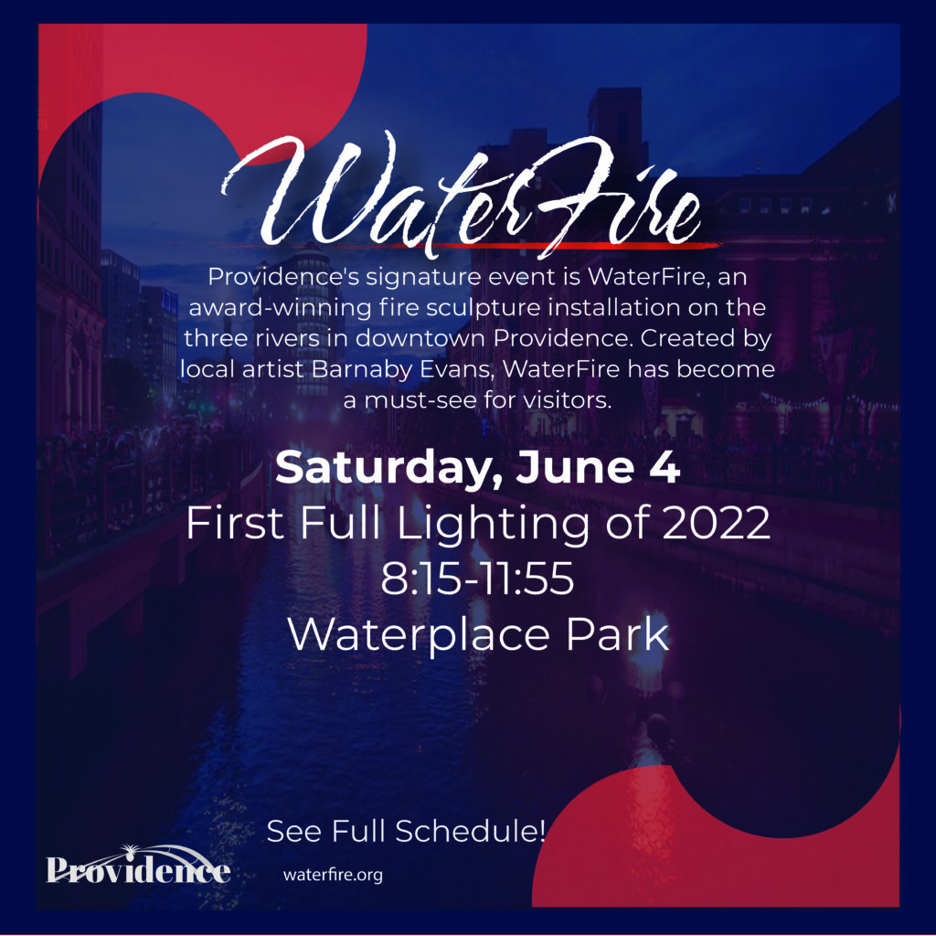
The Postcard
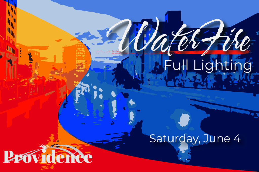
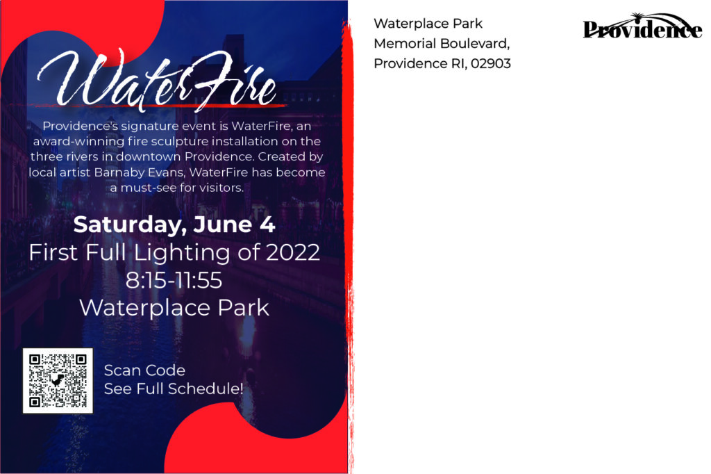
Next we were tasked with creating a postcard for an event that the city is known for. I chose to do “Waterfire”, because nothing is more representative of Providence more than this amazing event. An absolute must-see for anyone who is visiting for the first time. I chose to us the same technique on the front of the postcard that I used on the brochure so that both items would have a sense of unity. I kept the sam color scheme as well, but introduced more orange to help signify the event.
Additional Assets
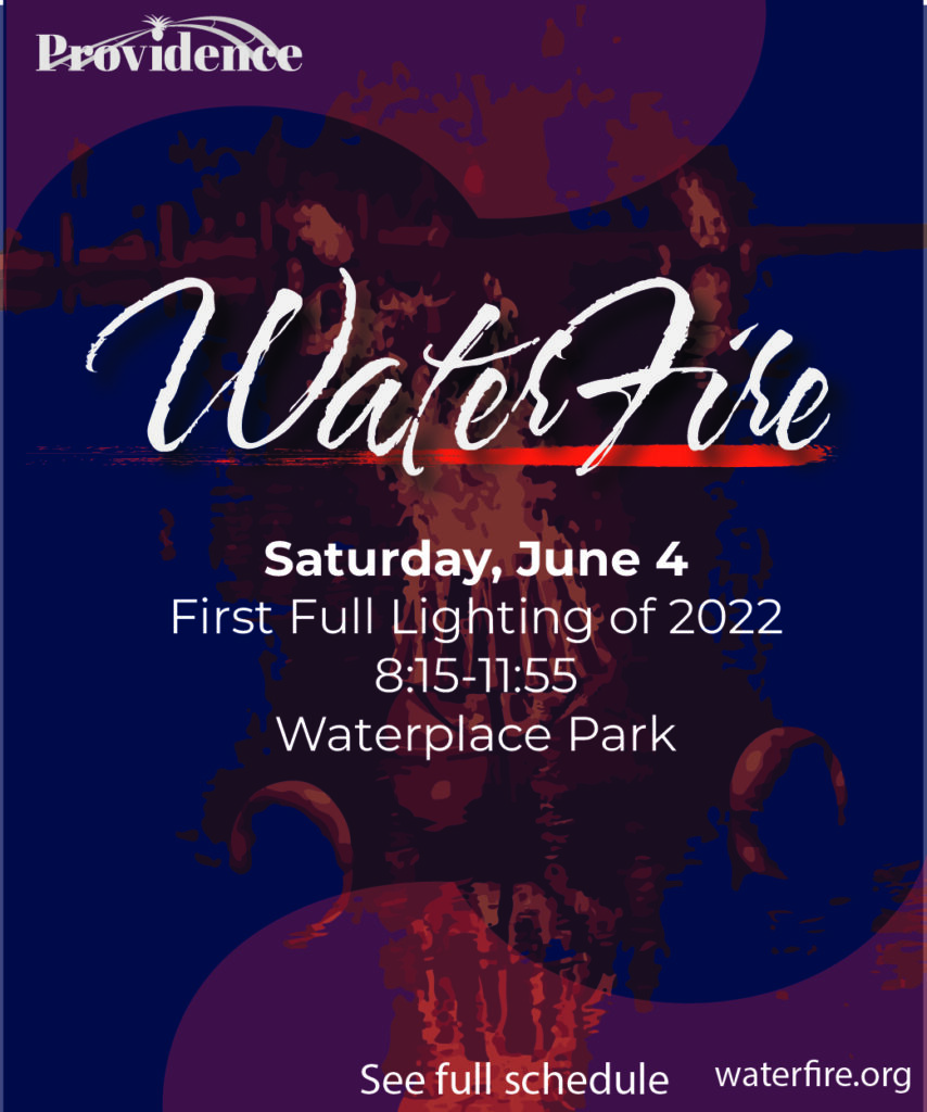
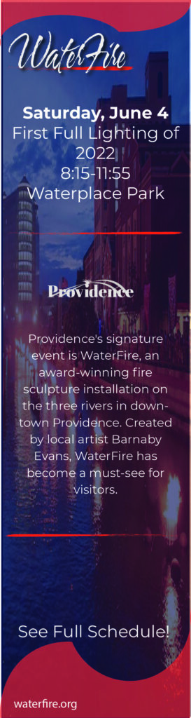
These are three banners that were created for the Waterfire event that could be used for various purposes. They are very similar to the postcard so the there is harmony between all the elements of the re-branding campaign.
The Final Result
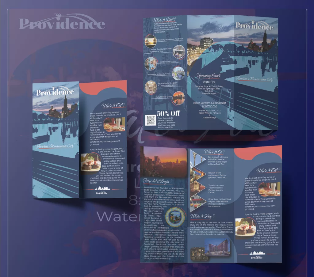
This is the end result of the whole process. We created a mockup of what the final product would look like. After seeing it in this form, you can tell that the whole concept works.