Recyclobot
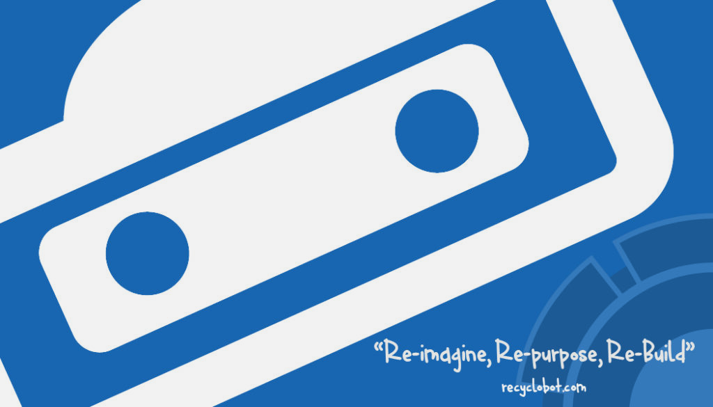
Recyclobot
This project was about branding. We were tasked with creating different assets for a company called Recyclobot. The goal of this company was to get children excited about recycling. The company has a monthly subscription that sends a box to your house every month that has the parts and instructions for how to build an item from discarded items that one may find in their house.
The Logo
The first thing we had to do was to create a logo for our product. We wanted to do something that would appeal to our age demographic of between 7 and 12 years old. We chose the colors based on a color scheme of an old toy store. We felt that the colors worked because they were primary colors, and could trigger that nostalgia response in the adults who would be purchasing these subscriptions. The font is playful and bold, and we incorporated aspects of mechanics and machines to illustrate what the product was about.
The Business Card
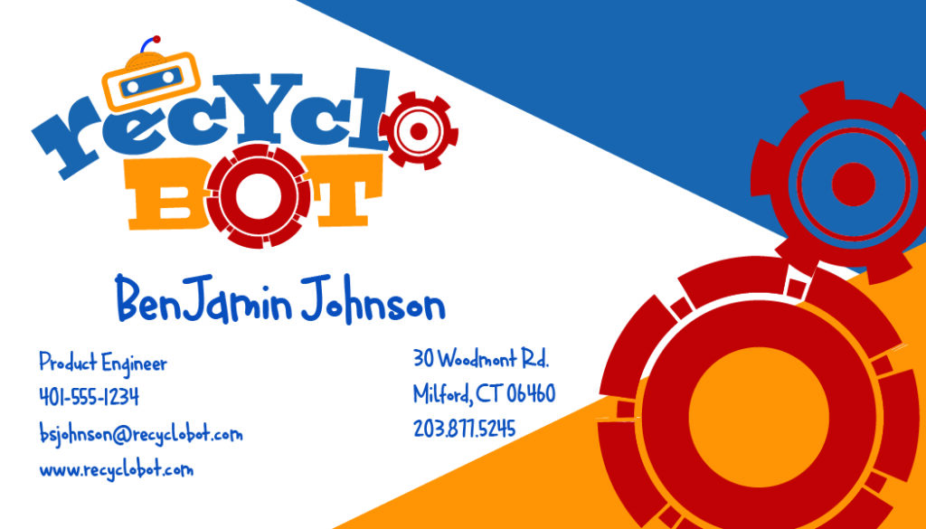

After we had decided on a logo, we were then tasked with making a business card. We had to incorporate our logo onto the card and practice elements of branding so that all of our assets could be identified as belonging to the same product. Above are the finished images of the front and back of the business card.
The Bot
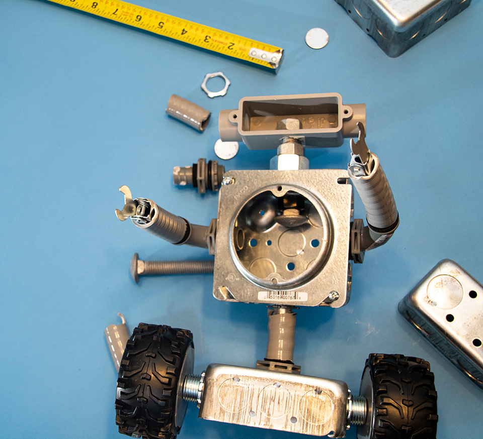
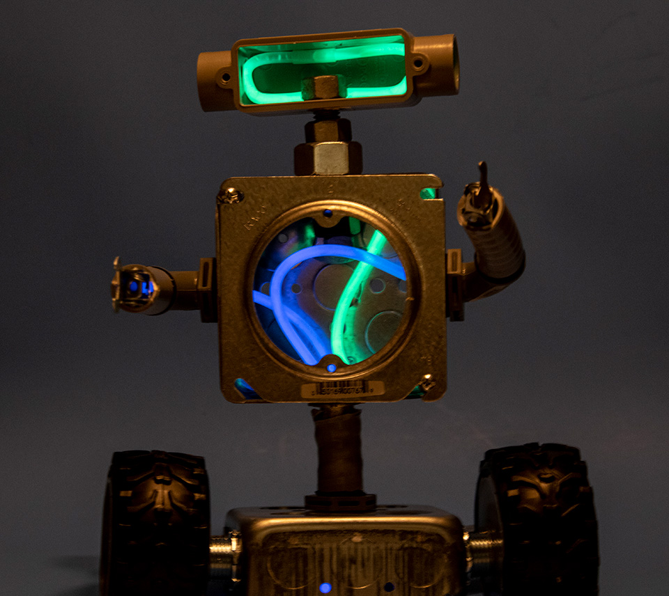
Now that we had some of our branding established, it was time to build the product. I used left over electrical equipment I had in my basement. I had always thought that some of the assemblies looked like a robot when I was putting them together as an electrician, so when I saw them, I thought they would be perfect for this project. I was able to construct something that resembled a robot and even added some glow sticks for that extra touch. While we were assembling the bot we were tasked with keeping track of everything that we did so that we would be able to repeat the process.
The Poster
The next part of this project was to make a poster that would come in the monthly subscription box. The purpose of the poster was to serve as instructions for the build and to act as a poster that could be hung up in the child’s room after build completion.
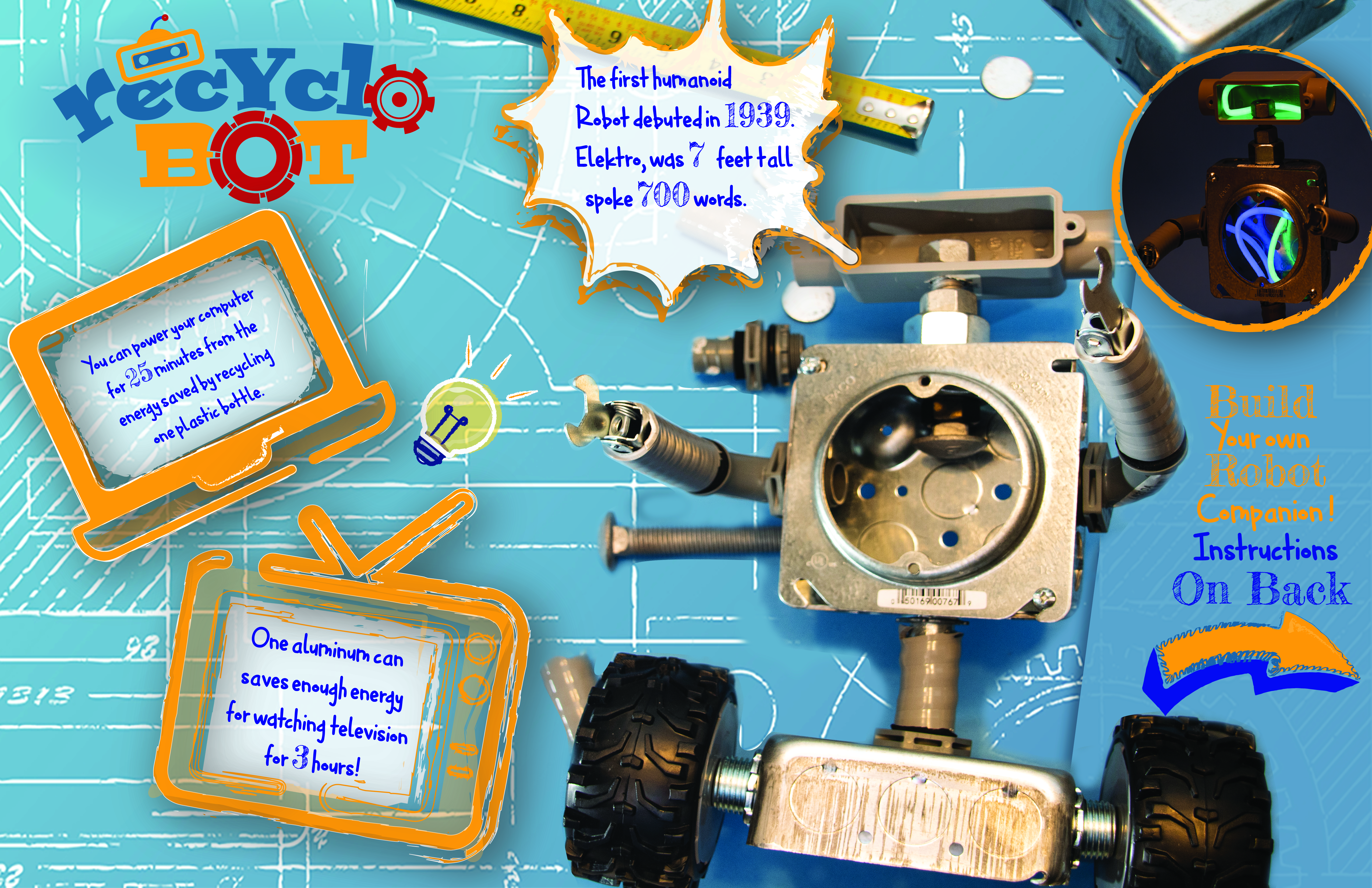
Above is the Poster side that would be displayed after the robot was assembled. We were tasked with putting three factoids about recycling in order to help promote interest in the process. It could also be used as a marketing tool to help advertise the subscription service. We stuck with the same color palette as in the logo and on the business card to create a sense of brand unity.
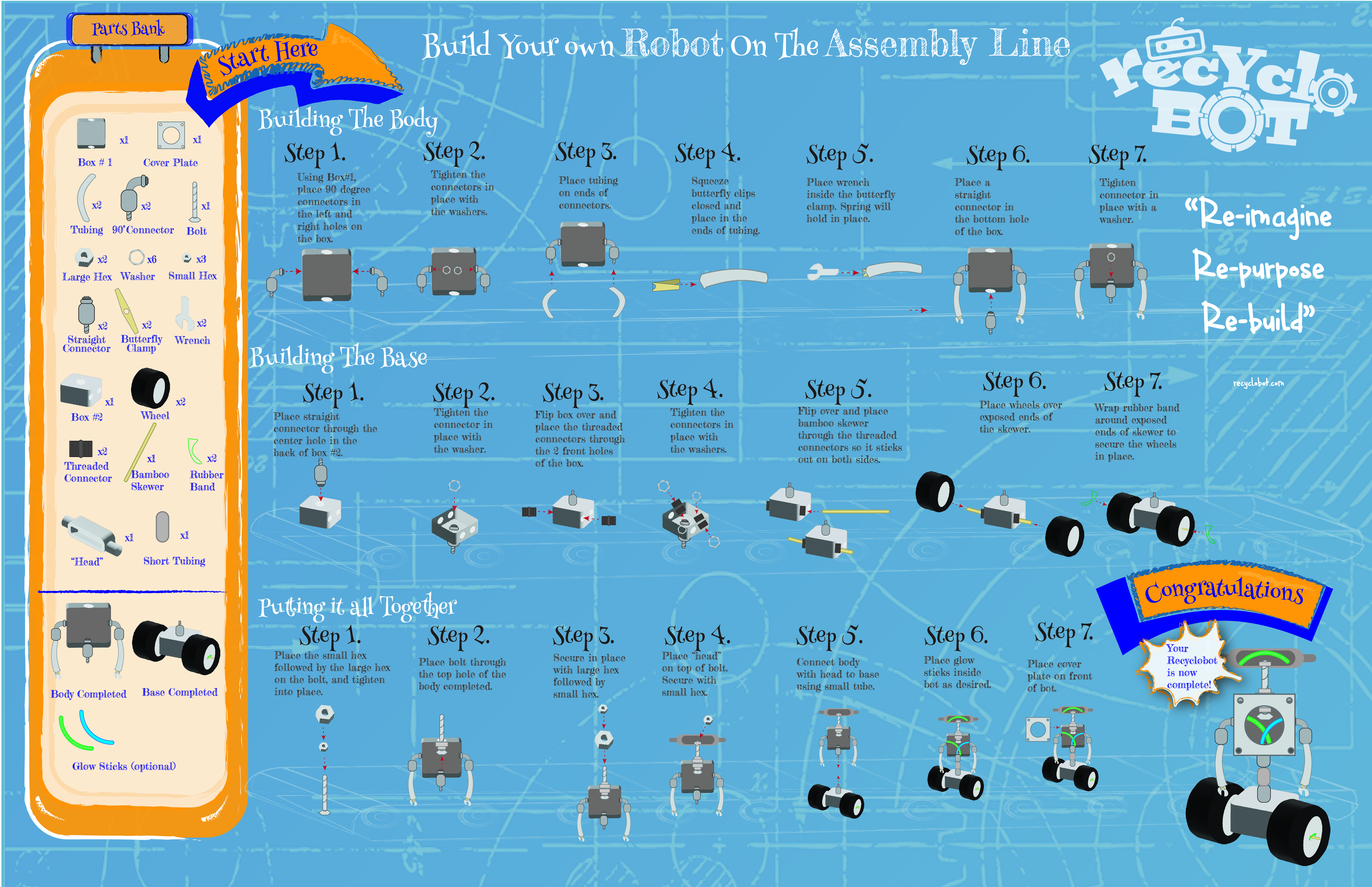
Here are the build instructions for the robot. This was probably the most challenging aspect of the project. We had to repeat the steps that we did in order to recreate our robot. Additionally, we had to illustrate each step and include a parts list. The project was enjoyable and turned out well considering all that needed to go into it to make it successful.